1. My typography is about basketball and I chose this because it is one of my favorite things to do and I really enjoy it.
2. I just chose words that I thought represented basketball very well, like famous players and quotes but also just basic words to describe it.
3. Now that I'm done it looks a lot better then I thought it would coming out, it was worth it because now I'm not going to fail.
4. Next time I would make the top part of it look more round and add another orange word to make it look more like a circle.
Thursday, June 13, 2013
Tuesday, June 11, 2013
Reflection PSA
1. A PSA is a public service announcement that gets a serious point across using a picture and few words.
2. No I didn't, my topic was drinking and driving and I knew that was bad already. :/
3. I feel like my final product got the point across like it was supposed too and it was pretty good.
4. The most difficult part of the project was thinking of an idea that was serious enough to put on a poster and inform people about. There were a lot of options but I chose the one I think is most serious.
5. I feel like over time I got better but I could still get a little better.
PSA blog post planning
I plan on doing a PSA about drinking and driving and show a bad car crash with an alcohol beverage next to the scene and say "Don't drink and drive." To get the point across that drinking and driving is bad.
Tuesday, May 21, 2013
Portrait blog post.
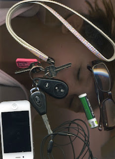
I chose to do a picture of my feet because I'm an active person and I work a lot and I'm always on my feet.
I put this picture of Brittani in front of the eiffel tower with a beret on because a big part of her ancestry is French.
Wednesday, May 15, 2013
Wednesday, May 8, 2013
Wednesday, May 1, 2013
iphrase
I chose iBall because I play basketball
2. I highlighted the basketball because it points out well what I mean by "iBall" considering that could mean any sport with a ball.
3. No tidbits.
Wednesday, April 24, 2013
Filter; Self Critique.
1. I think the light blue looking sky in the background in the best part about this picture.
2. I would make the water all blue instead of just one spot of it.
3. The most enjoyable part of this for me was making the original picture more colorful then what it really is.
4. I thought that finding 10 different filters that looked good was difficult because I often found myself reusing one on accident or one not looking good with certain filters.
5. Yes I think I will, if I have another picture like this one. I like using the color to highlight certain things and leaving others black and white.
6. I feel like my skills could be better but I have gotten better since the first project.
Snail Wordle
Snail Grass Droplets Swirls Shell Alone Green Antlers Black Orange Rain Water Wet Slippery Dark-Edges
-I couldn't get wordle or the other one to work so these are my words.
-I couldn't get wordle or the other one to work so these are my words.
Monday, April 22, 2013
Pop Art Critique
I critiqued Chelsea's Pop art.
I like how she doesn't repeat the same colors at all and the colors vary a lot. In one box she uses black and then in another she uses a bright green, so I like how different it is with every picture. I also like her focus picture, it's a pretty cool looking face.
I don't dislike anything about her picture :) Except the lines going through the boxes but it still looks pretty. :)
Friday, April 12, 2013
Pop art began in England in the mid 1950s. Andy Warhol's work explores the relationship between artistic expression and celebrity culture. He started off with coke bottles and comic strip. He discovered that he could make multiple patterns multiple times. When he wasn't getting the attention that he wanted he painted what he like most in the world and he painted money and cans of soup. Andy Warhol was an inspirational artist to many people.
Monday, April 1, 2013
Thursday, March 28, 2013
Monday, March 25, 2013
Subscribe to:
Comments (Atom)


